Trinity Gaming Studio Logo Design

Introduction
Trinity Gaming Studio approached the design of their logo with the intention of capturing the essence of connectivity and interaction that lies at the heart of gaming. The challenge was to create a visual identity that would resonate with gamers and stand out in the competitive gaming industry.
Design Evolution
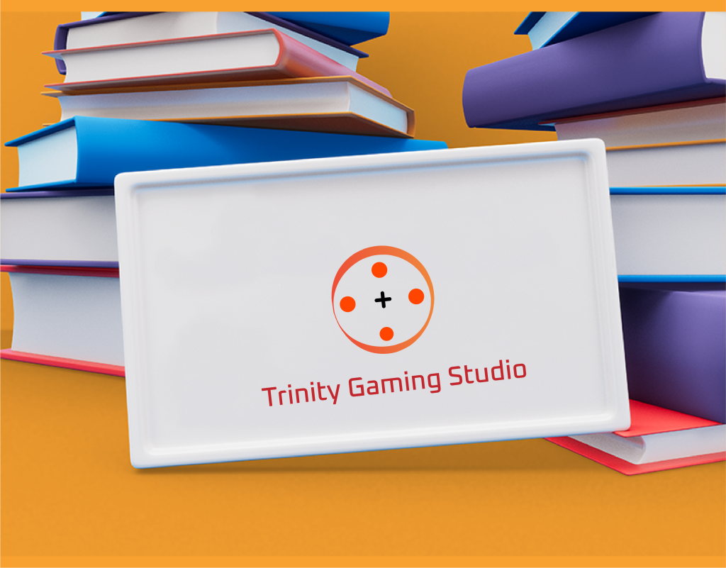
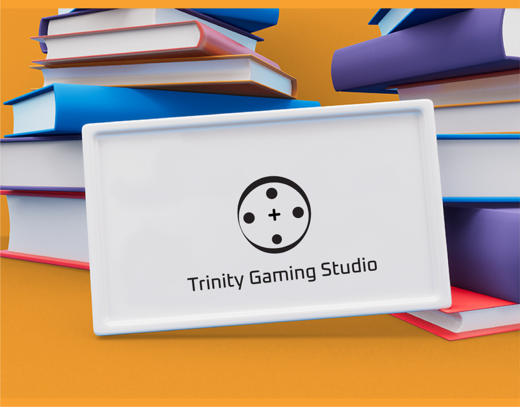
The logo’s evolution was guided by the concept of interconnectedness, a core value of Trinity Gaming Studio. The three controller buttons symbolize the studio’s commitment to creating games that bring people together, whether they are casual players or gaming enthusiasts.
Color Scheme Variations
Orange and Red Tones: These warm colors are used to evoke excitement and passion, qualities that the studio infuses into its games.
Grayscale: This scheme provides a sleek, modern look that appeals to a wide audience and offers versatility in various applications.
Black and Yellow Tones: The contrast between black and yellow offers a bold statement, capturing attention and signifying energy and innovation.
Typography Analysis
The typeface chosen for “Trinity Gaming Studio” is modern and clean, ensuring legibility across different mediums while also conveying a sense of professionalism and forward-thinking.
Target Audience Engagement
The logo is designed to appeal to a diverse gaming audience. The use of vibrant colors and recognizable gaming symbols aims to attract and engage players, fostering a sense of belonging to the Trinity community.
Application Across Various Media
The logo’s design is optimized for multiple media applications, from digital platforms like gaming interfaces and social media to physical merchandise and print materials. Its scalability ensures that it maintains its impact whether it’s on a large billboard or a small game icon.


Client
Trinity Gaming Studio
Service
Logo Design
Project
Dynamic
Conclusion
The Trinity Gaming Studio logo stands as a robust representation of the brand’s identity, reflecting both the spirit of gaming and the studio’s vision for community and connection. As the designer, this project was an exercise in balancing creativity with functionality, resulting in a logo that is not only aesthetically pleasing but also deeply rooted in the brand’s ethos. The design’s adaptability positions Trinity Gaming Studio to evolve and grow while maintaining a consistent and recognizable brand image.