Tintantin Gaming Logo Design

Project Overview
Client: Tintantin Gaming
Industry: Gaming and Entertainment
Project Duration: 6 Weeks
Design Team: 3 Designers, 1 Project Manager
Objective: Design a dynamic and modern logo for Tintantin Gaming that reflects the brand’s vibrant energy and passion for the gaming industry. The logo should be visually appealing, easily recognizable, and adaptable for various media and applications.
Design Requirements
- Visual Appeal: The logo must be striking and engaging to attract gamers.
- Versatility: It should work well in different sizes and backgrounds, both in color and monochrome.
- Modern Aesthetic: Reflect the cutting-edge nature of the gaming industry.
- Brand Identity: Incorporate elements that symbolize fun, competition, and community.
Design Process
1. Research and Analysis
Market Research:
- Analyzed logos of prominent gaming companies to identify common design trends and elements.
- Studied the preferences of the target audience to ensure the logo resonates with them.
Brand Analysis:
- Conducted workshops with Tintantin Gaming to understand their vision, mission, and unique selling points.
- Identified key brand attributes: excitement, innovation, inclusivity, and community.
2. Concept Development
Initial Sketches:
- Explored various concepts focusing on gaming symbols, dynamic shapes, and vibrant colors.
- Developed multiple rough sketches to brainstorm and visualize different ideas.
Digital Mockups:
- Converted the best sketches into digital formats using Adobe Illustrator.
- Experimented with different fonts, shapes, and color schemes to find the most compelling design.
3. Feedback and Iteration
Client Feedback:
- Presented several initial concepts to Tintantin Gaming.
- Collected feedback on preferred elements, color schemes, and overall impressions.
Refinement:
- Incorporated client feedback to refine the designs, focusing on enhancing clarity and visual impact.
- Conducted multiple iterations, adjusting colors, shapes, and typography as necessary.
4. Final Design
Elements:
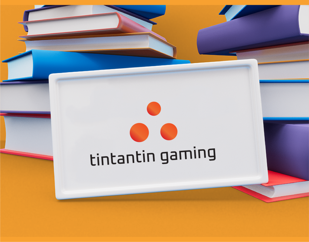
- Icon: Three circles arranged in a dynamic pattern, symbolizing excitement, movement, and gaming culture.
- Typography: A modern, sans-serif font that is bold and easily readable, reflecting a contemporary and professional image.
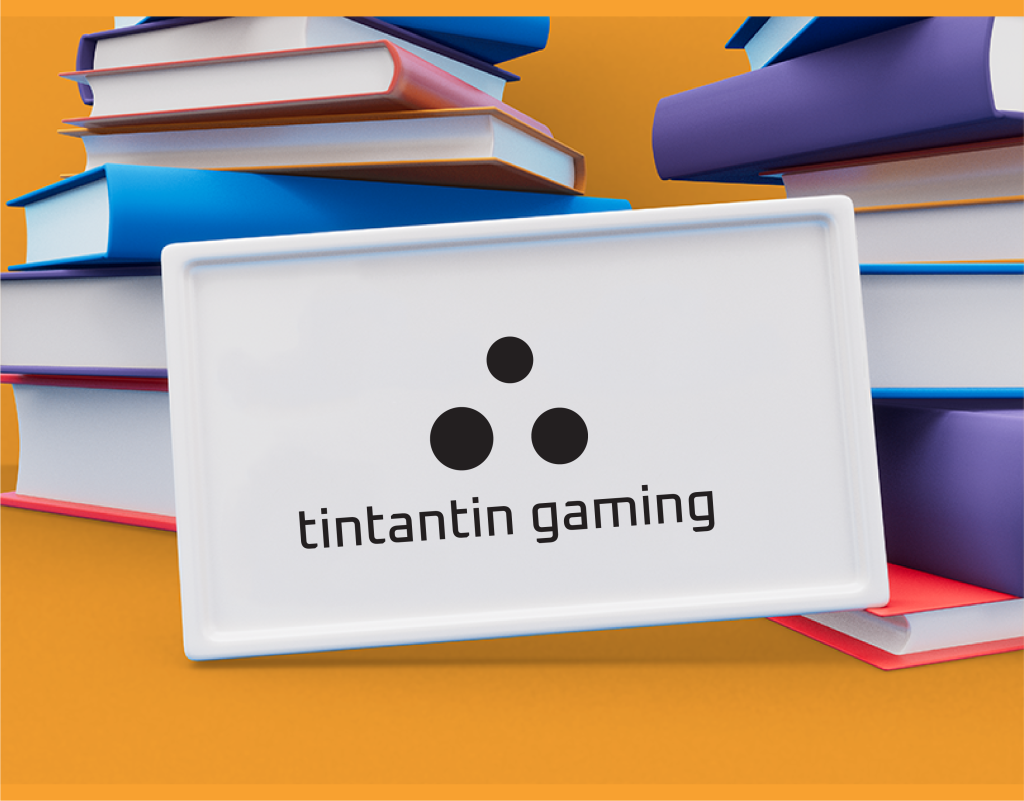
- Color Scheme: A gradient of vibrant oranges to signify energy and enthusiasm, with a black variant for versatile application.
Variations:
- Primary Logo: Gradient orange icon and text for standard use.
- Black and White Versions: For high-contrast applications and different background colors.
- Vertical and Horizontal Layouts: Ensuring adaptability to various formats and spaces.
Applications and Versatility
Digital Media:
- Website, social media profiles, and online advertisements.
- Stream overlays and video thumbnails.
Print Media:
- Business cards, letterheads, brochures, and posters.
Merchandising:
- Printed on gaming accessories, apparel, and promotional items.


Client
Tintantin Gaming
Services
Logo Design
Project
Dynamic
Conclusion
The new logo for Tintantin Gaming successfully captures the brand’s vibrant and dynamic essence. It is modern, versatile, and visually appealing, making it suitable for various applications and ensuring strong brand recognition in the competitive gaming industry. The iterative design process, involving thorough research and client collaboration, ensured that the final outcome aligns perfectly with Tintantin Gaming’s vision and resonates with its target audience.