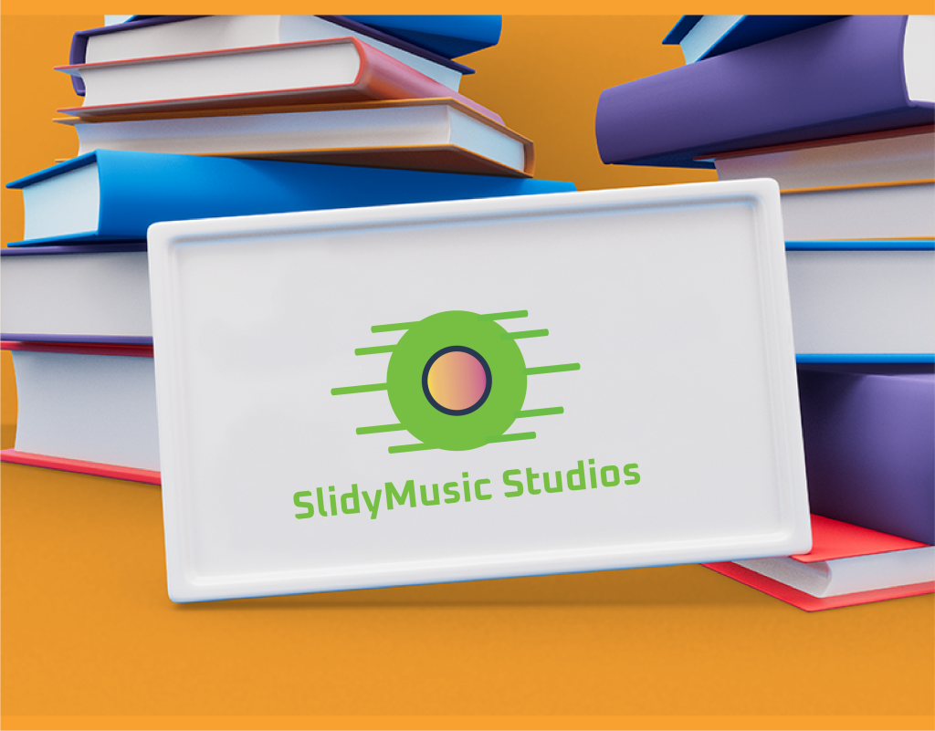
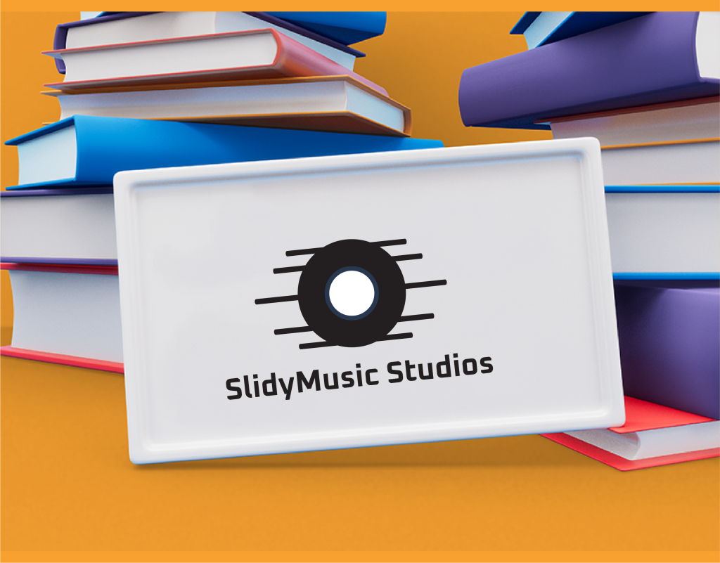
SlidyMusic Studios Logo Design

Introduction
In this project, I designed three logo variations for SlidyMusic Studios, a company likely specializing in music production or education. The goal was to create a logo that is modern, creative, and reflects the energy and flow of music.
Concept Development
- Musical Focus: The logo design should incorporate elements that clearly communicate the connection to music.
- Modern and Creative: The design should be modern and creative, appealing to a target audience interested in music production or education.
- Memorable Brand Identity: The logo should create a strong and memorable brand identity for SlidyMusic Studios.
Design Exploration
Core Element: Each logo variation features a visual element that represents music or the creative process. This could be a musical note, sound waves, or a playful depiction of sound or mixing equipment.
Text: The brand name “SlidyMusic Studios” is positioned below the central icon in all three variations. A carefully chosen font should complement the overall design aesthetic, being both modern and readable.
Color Palette: A vibrant color palette was used to reflect the energy and creativity associated with music. This could include blues, greens, or purples, possibly accented with contrasting colors for impact.
-
Variations:
- Logo 1 (Musical Note): This variation features a stylized musical note in a vibrant color. The musical note is a universal symbol of music and clearly communicates the studio’s focus.
- Logo 2 (Sound Waves): This logo utilizes abstract depictions of sound waves to represent the flow of music and the production process.
- Logo 3 (Mixing Sliders): This variation incorporates stylized icons of mixing sliders commonly found in music production software. This option appeals to a more technical audience familiar with music creation tools.
Client Presentation & Selection
The client reviewed all three variations, and we discussed their vision for the studio:
- Brand Image: We explored how each logo represents different aspects of SlidyMusic Studios’ brand image. For instance, the musical note logo emphasizes the core focus on music, while the mixing sliders logo targets a more technical audience.
- Target Audience: Considering the target audience, we explored which logo might resonate best with potential clients, whether musicians, students, or music enthusiasts.
While this case study doesn’t reveal the final selection, each variation offers distinct strengths:
- Logo 1 (Musical Note): A straightforward and universally understood symbol, ideal for broad audience recognition.
- Logo 2 (Sound Waves): A more abstract and creative option, conveying the dynamic nature of music production.
- Logo 3 (Mixing Sliders): A targeted design that appeals to those familiar with music production equipment.


Client
SlidyMusic Studios
Service
Logo Design
Project
Dynamic
Conclusion
This case study showcases the design process for a music studio logo. The use of a modern font and a vibrant color palette alongside the brand name “SlidyMusic Studios” effectively communicates the studio’s creative energy. The exploration of multiple variations allowed for client participation and a final logo design that aligns with SlidyMusic Studios’ brand identity.