Chilli Sauce Packaging

Background
Red Dew Chili Farm, a renowned producer of high-quality chili sauces, aimed to rebrand its hot sauce product line to enhance market appeal and visibility. The goal was to create a packaging design that effectively communicates the product’s unique qualities, including its intense heat and premium ingredients, while standing out on retail shelves.
Design Objectives:
- Visual Appeal: Create an eye-catching design that captures the attention of consumers.
- Brand Identity: Reflect the brand’s identity and the product’s fiery nature.
- Information Clarity: Clearly display key product information, such as the Scoville heat units (SHU) and ingredient highlights.
- Usability: Ensure the packaging is functional and user-friendly.
- Consistency: Maintain consistency with Red Dew Chili Farm’s overall branding.
Design Features:
-
Color Scheme:
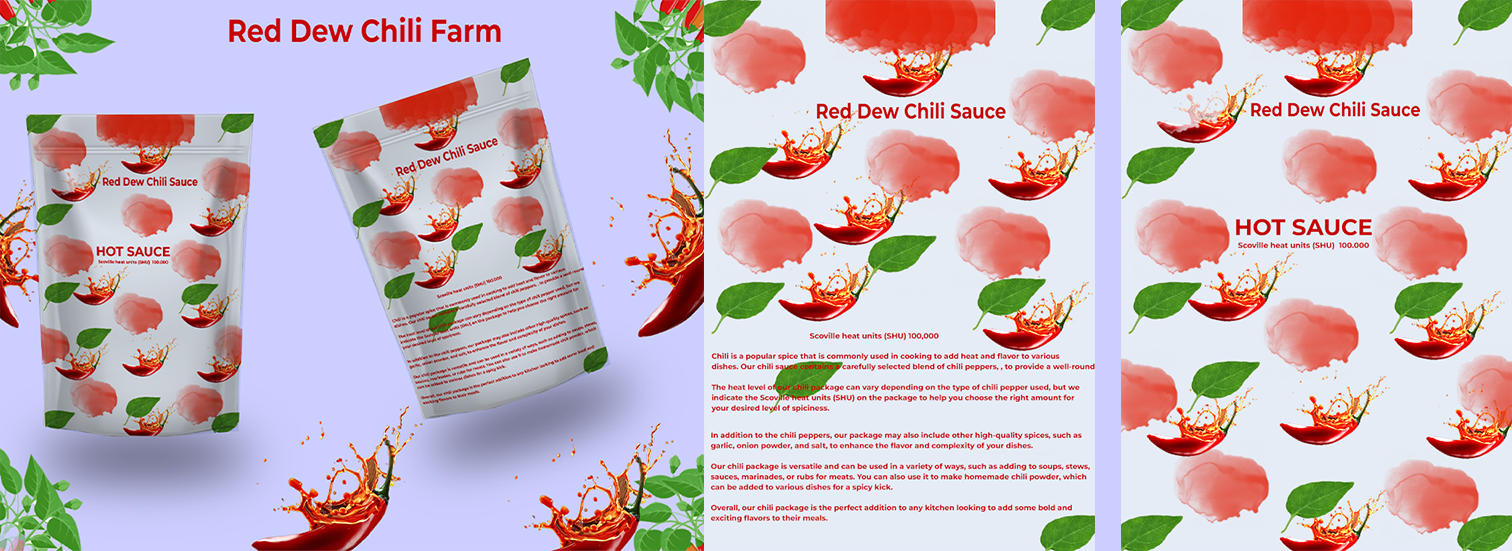
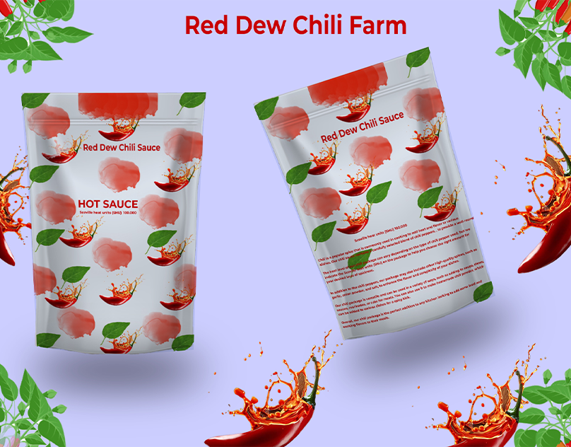
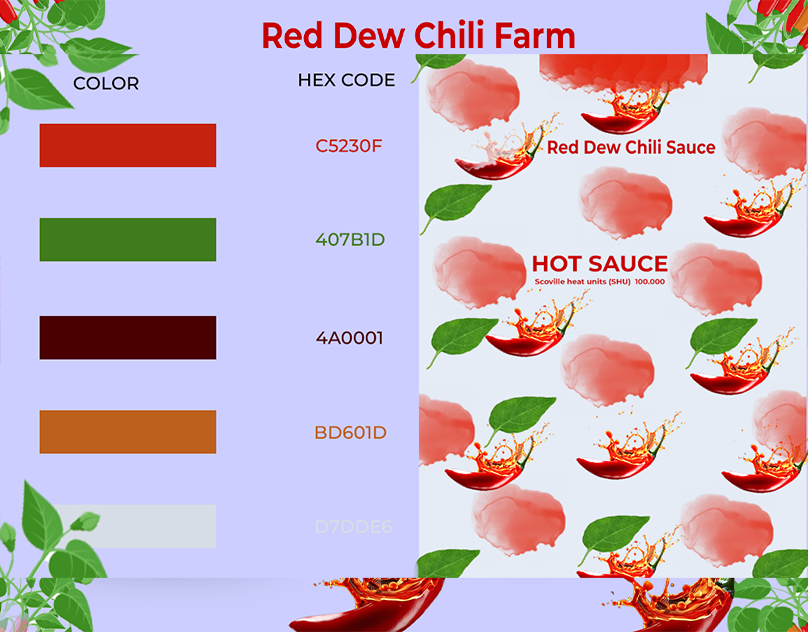
- Primary Colors: Red and green are prominently used, symbolizing chili peppers and freshness.
- Background: A clean, light purple background provides a contrast that makes the red and green elements pop, enhancing visibility.
-
Graphics and Imagery:
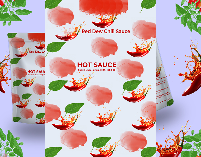
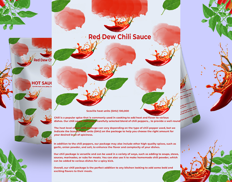
- Chili Peppers: Vibrant images of red chili peppers emphasize the product’s main ingredient and its spiciness.
- Splashes and Leaves: Illustrations of chili splashes and green leaves add dynamism and a sense of natural ingredients.
- Pattern: A repeated pattern of chili and splash icons creates a cohesive and attractive visual texture.
-
Typography:
- Brand Name: “Red Dew Chili Farm” is prominently displayed at the top in a bold red font, ensuring brand recognition.
- Product Name and SHU: “Hot Sauce” and “Scoville heat units (SHU) 100,000” are clearly written, highlighting the product’s intensity and quality.
- Description: The back of the packaging includes a detailed description of the product, its uses, and benefits in smaller, readable text.
-
Functional Aspects:
- Packaging Type: A resealable pouch ensures the sauce stays fresh and is easy to use.
- Size and Shape: The compact and ergonomic design makes it convenient for both retail display and consumer handling.
Implementation Process:
-
Market Research:
- Conducted surveys and focus groups to understand consumer preferences and perceptions.
- Analyzed competitor packaging to identify gaps and opportunities for differentiation.
-
Design Development:
- Collaborated with graphic designers to create initial concepts.
- Iterated designs based on feedback from stakeholders and potential customers.
- Ensured compliance with packaging regulations and standards.
-
Prototyping and Testing:
- Developed prototypes to test the design’s practicality and visual impact.
- Conducted usability tests to refine features such as the resealable pouch and readability of information.
-
Finalization and Launch:
- Finalized the design after thorough testing and feedback.
- Launched the new packaging with a marketing campaign to highlight the rebranding.
Results:
- Increased Sales: The new packaging design led to a 20% increase in sales within the first three months of launch.
- Brand Recognition: Enhanced brand recognition and loyalty due to the distinctive and appealing design.
- Consumer Feedback: Received positive feedback from consumers regarding the design’s aesthetics and functionality.
Year
2024
Client
Red Dew Chili Farm
Services
Packaging Design
Project
Dynamic
Description
Conclusion: The new packaging design for Red Dew Chili Farm’s hot sauce successfully achieved its objectives by combining striking visuals with practical features. It effectively communicated the product’s fiery nature and premium quality, resulting in increased market appeal and consumer satisfaction.