Orange Ways Logo Design

Introduction
In this project, I developed three logo variations for a company called Orange Ways. The brief was to create a logo that captures the essence of the company’s name while offering a versatile design for various applications.
Concept Development
- Abstract Interpretation: Given the name “Orange Ways,” I opted for an abstract approach to the logo design. This allows for more creative freedom and avoids literal interpretations of the word “orange” (the fruit).
- Focus on Color: While the design is abstract, color plays a central role. Orange is the primary color, referencing the company name and potentially conveying a sense of energy, warmth, or creativity.
- Versatility: A key goal was to ensure the logo functions well in various applications, including print, digital media, and even as a favicon.
Design Exploration
- Core Element: Each logo variation incorporates a central orange shape as the focal point. This shape is unique across the three variations.
-
Color Palette:
- All three logos primarily use orange in different hues or shades.
- Additional colors are used strategically:
- Black for text and potentially for adding contrast.
- White for providing balance and potentially representing openness or freshness.
-
Variations:
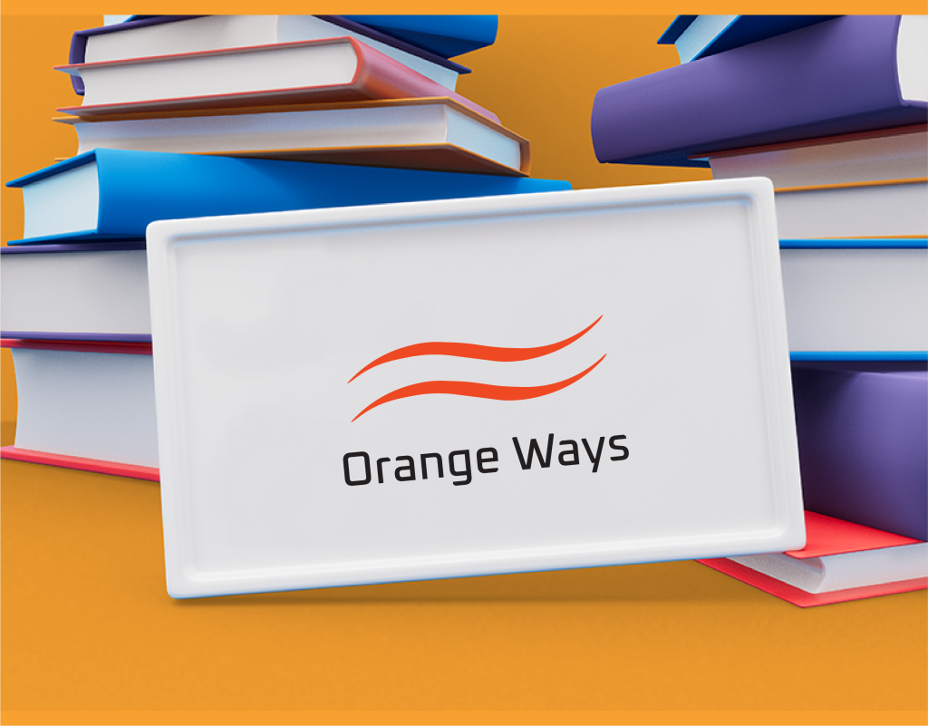
- Logo 1 (Swirling Lines): This variation utilizes swirling orange lines that form a dynamic central shape. It evokes a sense of movement and energy.
- Logo 2 (Geometric Intersections): This logo features geometric shapes in orange and black that intersect in the center. It projects a feeling of structure and balance.
- Logo 3 (Minimalist Curve): This variation utilizes a simple curved orange shape on a white background. It offers a clean and minimalist aesthetic.
Client Presentation & Selection
While the client’s choice isn’t revealed in this case study, each logo variation offers distinct advantages:
- Logo 1 (Swirling Lines): A great choice if the client wants a logo that conveys energy and dynamism.
- Logo 2 (Geometric Intersections): An ideal option if the client desires a logo that emphasizes structure, stability, and professionalism.
- Logo 3 (Minimalist Curve): A perfect choice if the client seeks a clean, modern, and versatile logo.
The most suitable logo will depend on the specific brand image Orange Ways aims to cultivate and the message they want to communicate to their target audience. During the presentation, we explored these factors in detail to guide the client’s decision-making process.


Client
Orange Ways
Service
Logo Design
Project
Dynamic
Conclusion
This case study highlights the value of presenting multiple logo design variations. It allows for a collaborative approach, where the client actively participates in selecting the logo that best embodies their brand identity. The use of an abstract concept and a focus on the color orange provides a unique and memorable brand mark for Orange Ways.