Mixed Logo Design Project

Overview
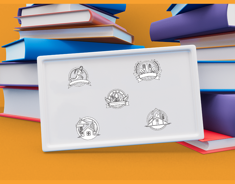
This case study explores the creation of a diverse set of logos for different industries, including fitness, dining, construction, and urban development. The logos were designed to convey each sector’s unique identity while maintaining a cohesive visual style that reflects professionalism, clarity, and brand essence.
Objectives
- Distinct Identity: Develop logos that distinctly represent each industry.
- Versatility: Ensure the logos are versatile for various applications (e.g., print, digital, merchandise).
- Brand Recognition: Create memorable designs that enhance brand recognition.
- Cohesiveness: Maintain a consistent design language across different industries to demonstrate design capability.
Design Elements
-
Color Scheme:
- Green and Orange: Predominantly used in logos related to health, fitness, and dining to symbolize freshness, vitality, and energy.
- Navy Blue and Orange: Used for construction and urban development to convey stability, trust, and growth.
-
Typography and Symbols:
- Fitness: Dynamic human figure in motion, signifying energy and health.
- Dining: Cutlery and fresh produce elements, emphasizing nourishment and quality dining experiences.
- Construction: Crane and buildings, symbolizing development, growth, and architectural integrity.
- Urban Development: Cityscape and buildings, indicating modernization and infrastructure development.
-
Layout and Composition:
- Circular Frames: Used across all logos to provide a cohesive visual structure and balance.
- Banners and Ribbons: Incorporate text or additional elements, enhancing the logo’s narrative and aesthetic appeal.
Process
-
Research and Inspiration:
- Conducted industry-specific research to understand key visual elements and trends.
- Gathered inspiration from successful brands and contemporary design styles.
-
Concept Development:
- Created initial sketches and digital drafts for each logo.
- Focused on achieving a balance between industry specificity and cohesive design elements.
-
Feedback and Iteration:
- Presented initial designs to stakeholders for feedback.
- Iteratively refined the logos based on input to better meet the objectives.
-
Finalization:
- Finalized each logo with polished details, ensuring high resolution and clarity.
- Prepared versatile versions for various use cases (e.g., monochrome, full color, scalable vector formats).
Individual Logo Analysis
-
Fitness Logo:
- Design: A stylized runner inside a circular frame with a ribbon banner.
- Color: Green symbolizes health and vitality.
- Message: Represents energy, movement, and a commitment to fitness.
-
Dining Logo:
- Design: Fork, knife, and spoon with leaf elements inside a laurel wreath.
- Color: Green and orange signify freshness and quality.
- Message: Conveys quality dining and a focus on fresh, healthy food.
-
Construction Logo:
- Design: Crane lifting a building structure within a circular frame.
- Color: Navy blue for stability and orange for energy.
- Message: Highlights strength, development, and architectural precision.
-
Urban Development Logo:
- Design: Stylized cityscape and buildings in a circular frame.
- Color: Navy blue and orange indicate growth and modernity.
- Message: Reflects urban growth, modernization, and infrastructure development.
Results
- Enhanced Brand Recognition: Each logo effectively communicates the core values and identity of the respective industry.
- Versatility: Logos are adaptable for multiple formats, enhancing their usability across various mediums.
- Positive Feedback: Received strong approval from stakeholders, appreciating the balance of industry specificity and cohesive design.
- Increased Engagement: The visually appealing and professionally designed logos have helped in attracting attention and engaging target audiences.


Services
Logo Design
Project
Dynamic
Conclusion
The mixed logo design project successfully achieved its objectives, demonstrating the ability to create distinct yet cohesive logos for different industries. The process highlights the importance of research, iterative feedback, and attention to detail in developing effective visual identities.
Future Recommendations
- Continuous Update: Regularly update logos to keep them relevant with changing trends.
- Extended Branding: Develop comprehensive branding guidelines for each logo to ensure consistent application across all platforms.
- Brand Storytelling: Leverage the logos in marketing materials to tell compelling brand stories and connect with the audience on a deeper level.
This case study underscores the effectiveness of strategic design in building strong, recognizable brands across diverse industries.