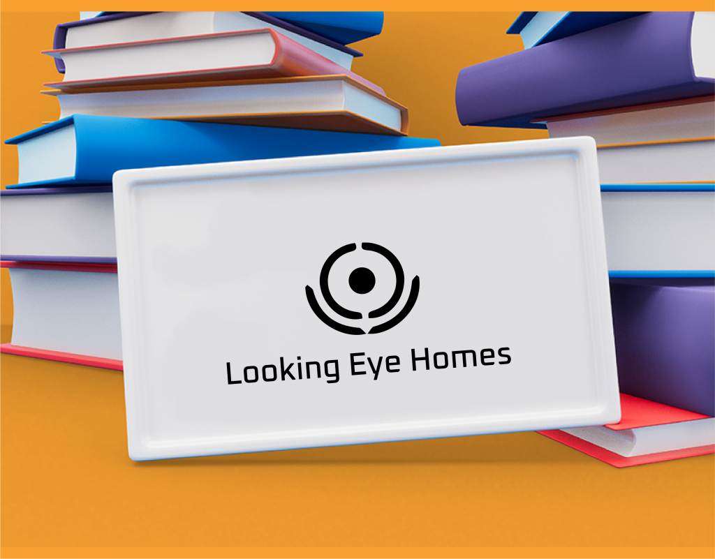
Looking Eye Homes Logo Design

Project Overview
Client: Looking Eye Homes
Industry: Real Estate
Project Duration: 8 Weeks
Design Team: 2 Designers, 1 Brand Strategist, 1 Project Manager
Objective: Create a distinctive and professional logo for Looking Eye Homes that communicates trust, security, and innovation in the real estate industry. The logo should be versatile, modern, and easily recognizable across various platforms and media.
Design Requirements
- Professionalism: The logo must convey a sense of reliability and trustworthiness.
- Versatility: It should be effective in different sizes, colors, and mediums.
- Modern Aesthetic: Reflect a contemporary and innovative approach to real estate.
- Brand Identity: Incorporate elements that symbolize vision, protection, and home.
Design Process
1. Research and Analysis
Market Research:
- Examined logos of leading real estate companies to understand common design elements and industry standards.
- Studied the target audience’s preferences and expectations from a real estate brand.
Brand Analysis:
- Conducted in-depth meetings with Looking Eye Homes to understand their mission, values, and target market.
- Identified key brand attributes: trust, innovation, protection, and vision.
2. Concept Development
Initial Sketches:
- Explored various concepts focusing on home symbols, eyes, and protective elements.
- Developed multiple rough sketches to brainstorm and visualize different ideas.
Digital Mockups:
- Converted selected sketches into digital formats using Adobe Illustrator.
- Experimented with different fonts, shapes, and color schemes to find the most compelling design.
3. Feedback and Iteration
Client Feedback:
- Presented initial concepts to Looking Eye Homes.
- Collected feedback on preferred elements, color schemes, and overall impressions.
Refinement:
- Incorporated client feedback to refine the designs, enhancing clarity and visual impact.
- Conducted multiple iterations, adjusting colors, shapes, and typography as necessary.
4. Final Design
Elements:
- Icon: A stylized eye with a dot in the center, encircled by protective arcs that suggest both vision and security, signifying the company’s watchful and caring approach to real estate.
- Typography: A modern, clean sans-serif font that conveys professionalism and reliability.
- Color Scheme: A gradient of orange for vibrancy and innovation, with a black variant for versatile application.
Variations:
- Primary Logo: Gradient orange icon and text for standard use.
- Black and White Versions: For high-contrast applications and different background colors.
- Vertical and Horizontal Layouts: Ensuring adaptability to various formats and spaces.
Applications and Versatility
Digital Media:
- Website, social media profiles, and online advertisements.
- Email signatures and digital brochures.
Print Media:
- Business cards, letterheads, brochures, and flyers.
- Signages and billboards.
Merchandising:
- Promotional materials like pens, notepads, and keychains.


Client
Looking Eye Homes
Services
Logo Design
Project
Dynamic
Conclusion
The new logo for Looking Eye Homes effectively communicates the brand’s core values of trust, security, and innovation. It is modern, versatile, and visually appealing, making it suitable for various applications and ensuring strong brand recognition in the competitive real estate industry. The iterative design process, involving thorough research and client collaboration, ensured that the final outcome aligns perfectly with Looking Eye Homes’ vision and resonates with its target audience.