Laundry Service Poster Designs

Poster Design 1: "Garmet Cleaning"
Visual Elements:
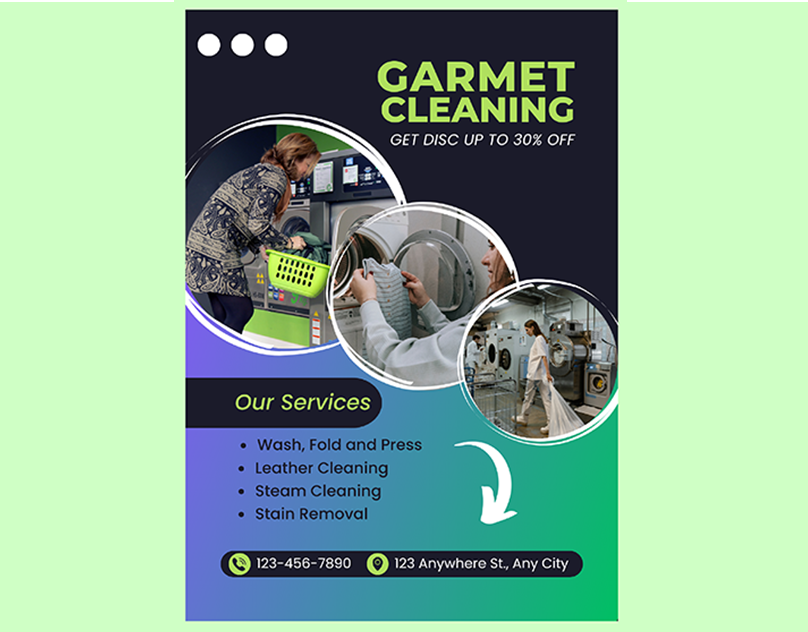
- Color Scheme: This poster uses a gradient background transitioning from blue to green, creating a visually appealing and modern look. The bright green text stands out against the dark background, ensuring readability.
- Imagery: The use of circular images depicting various aspects of the laundry process (washing machines, folding clothes) gives a dynamic and engaging look. These images directly relate to the services offered, making the poster visually relevant.
- Typography: The bold, sans-serif font in the headline “GARMET CLEANING” ensures that the main service is immediately clear. The use of all caps and bright green color draws attention effectively.
Layout:
- Information Hierarchy: The poster employs a clear hierarchy, with the main service (“GARMET CLEANING”) prominently displayed at the top, followed by the discount offer. Below, the list of services is neatly presented, and contact details are placed at the bottom.
- Call to Action: The discount offer (“GET DISC UP TO 30% OFF”) is placed near the top, acting as an immediate call to action that encourages potential customers to read further.
Effectiveness:
- Strengths: The poster’s modern design, clear imagery, and straightforward information hierarchy make it very effective in capturing attention and conveying the services offered.
- Weaknesses: The typo in “GARMET” (should be “GARMENT”) may affect credibility. Additionally, the discount offer could be more prominent to further entice potential customers.
Poster Design 2: "Laundry Service"
Visual Elements:
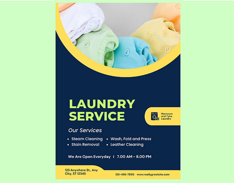
- Color Scheme: This poster uses a more subdued and professional color scheme with dark blue and yellow accents. This combination is visually appealing and gives a sense of reliability and professionalism.
- Imagery: The single large image of folded laundry in pastel colors is clean and visually soothing, suggesting quality and care in the services provided.
- Typography: The headline “LAUNDRY SERVICE” is in a bold, sans-serif font that is easy to read. The use of white text against a dark background ensures high contrast and readability.
Layout:
- Information Hierarchy: The headline is prominently placed at the top, followed by the list of services. The operational hours are clearly mentioned, along with contact information and location at the bottom.
- Call to Action: While there is no explicit discount or offer, the clear presentation of services and operational hours serves as an indirect call to action, emphasizing the convenience and availability of the services.
Effectiveness:
- Strengths: The clean and professional design conveys a sense of trust and reliability. The clear layout and use of imagery align well with the service, making the information easy to digest.
- Weaknesses: The lack of a promotional offer might reduce immediate customer engagement. Including an incentive could potentially increase the poster’s effectiveness.
Comparative Analysis:
1. Visual Appeal:
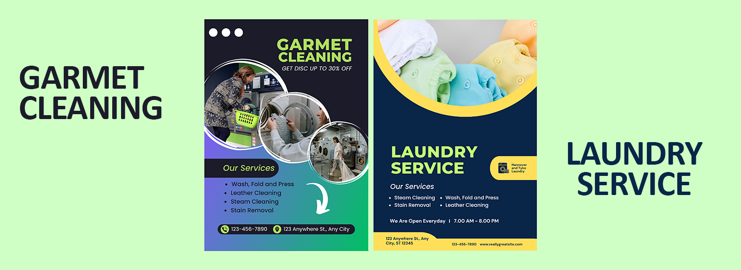
- Poster 1 employs a more vibrant and modern aesthetic, likely to appeal to a younger audience or those looking for trendy services.
- Poster 2 uses a professional and clean design, appealing to customers seeking reliable and high-quality services.
2. Information Delivery:
- Poster 1 focuses on attracting customers with a discount offer, immediately highlighting a benefit.
- Poster 2 provides comprehensive information about the services and operational hours, emphasizing reliability and availability.
3. Target Audience:
- Poster 1 may appeal more to budget-conscious customers looking for deals.
- Poster 2 targets customers prioritizing quality and convenience over discounts.


Client
Sophia Cleaners
Services
Poster Design
Project
Dynamic
Conclusion
Both poster designs effectively communicate their intended messages, though they cater to slightly different target audiences. Poster 1 stands out with its vibrant design and discount offer, making it more likely to attract immediate attention. Poster 2 excels in presenting a professional and trustworthy image, appealing to those looking for dependable service. A combination of both approaches—integrating a professional look with a clear call to action or promotional offer—could create the most compelling and effective design.