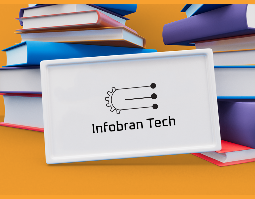
Infobran Tech Logo Design

Introduction
The “Infobran Tech” logo was conceptualized to embody the innovative and forward-thinking ethos of the company. The design process was meticulous, aiming to create a visual identity that would resonate with the target audience and stand out in the competitive tech industry.
Design Development
The design journey began with a brainstorming session to identify key elements that represent Infobran Tech’s core values: innovation, reliability, and connectivity. The stylized ‘I’ in the logo is a nod to these principles, resembling a key that signifies access to information and solutions.
Color Scheme Rationale
The color palette was chosen with precision:
- Black Background: Conveys sophistication and authority.
- Orange ‘I’: Represents energy and creativity.
- Yellow, Red, and Orange Stripes: Symbolize diversity, passion, and a dynamic nature.
Typography Choice
The company name is rendered in lowercase letters to project approachability and modernity. The sans-serif font was selected for its readability and contemporary feel, aligning with the tech industry standards.
Target Audience Consideration
The logo was designed with the tech-savvy and innovation-driven audience in mind. It aims to appeal to both young entrepreneurs and established tech enthusiasts who value sleek and meaningful design.
Application Across Various Media
The logo’s versatility was tested across multiple platforms, from digital media to print. It maintains its integrity on different backgrounds, ensuring brand consistency.
Challenges Faced
One of the main challenges was creating a design that is both timeless and adaptable to future trends. Balancing simplicity with distinctiveness required several iterations and feedback sessions.


Client
Infobran Tech
Services
Logo Design
Project
Dynamic
Conclusion
The final “Infobran Tech” logo successfully encapsulates the essence of the brand. It is not only visually appealing but also functional across various applications. The design process highlighted the importance of understanding the brand’s mission and the audience’s expectations. Future iterations could explore the use of augmented reality elements to further enhance the logo’s interactivity and engagement potential.
As the designer, this case study reflects my commitment to delivering a logo that is not just a symbol but a powerful tool for brand identity and communication. The “Infobran Tech” logo stands as a testament to thoughtful design and strategic branding.