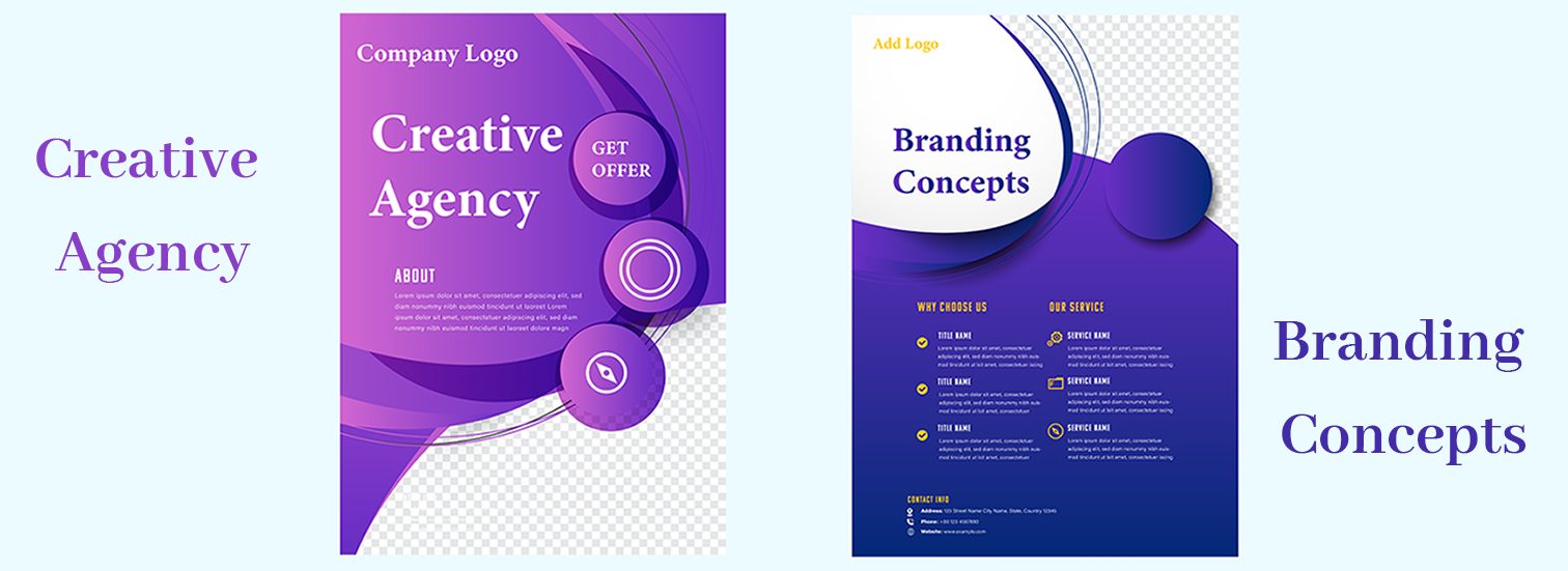
Flyers: Branding Creative Agency and Branding Concepts

1. Color Harmony
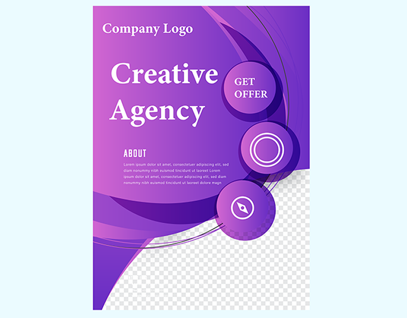
- Purple Tones: We’ll incorporate the rich purple color from the “Creative Agency” flyer. Purple symbolizes creativity, sophistication, and imagination.
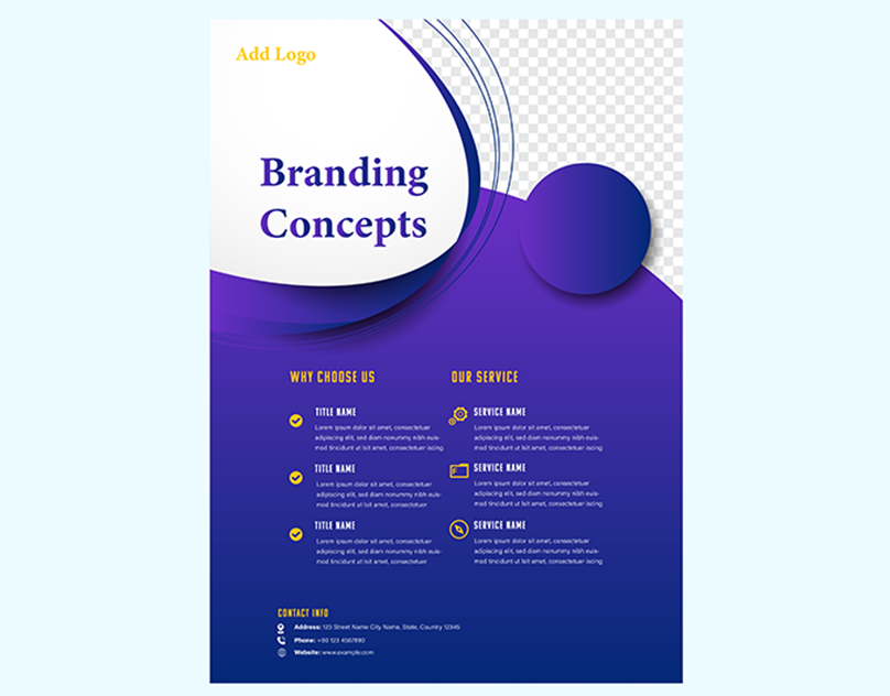
- Blue Hues: We’ll infuse the calming blue shades from the “Branding Concepts” flyer. Blue represents trust, reliability, and professionalism.
2. Circular Design Motifs
- Both flyers feature circular design elements. We’ll maintain this consistency to create a cohesive visual language.
- Circular shapes evoke unity, balance, and inclusivity. They can represent completeness and endless possibilities.
3. Layout Sections
- We’ll include an engaging narrative about the agency’s background, mission, and values.
- Highlight the agency’s unique selling points and what sets it apart from competitors.
4. Service Offerings
- Use bullet points to showcase the services offered by the agency.
- Emphasize the benefits clients can expect, such as personalized solutions, expertise, and results.
Client Testimonials
- Feature authentic testimonials from satisfied clients.
- Testimonials build credibility and trust, assuring potential clients of the agency’s quality.
Clear Call-to-Action
- Place a prominent “Get Offer” button, encouraging users to take action.
- Ensure it stands out against the background and leads to a relevant landing page.
Logos and Contact Information
- Allocate space for company logos at the top of the flyer.
- Include essential contact details (phone, email, website) at the bottom.


Flyer Design
Project
Dynamic
Conclusion
In this blended case study, we harmonized the purple tones of the “Creative Agency” flyer with the calming blue hues of the “Branding Concepts” design. By maintaining circular motifs and strategically organizing layout sections, we created an impactful marketing material.