Exiith Arena Logo Design

Project Overview: Exiith Arena Logo Exploration
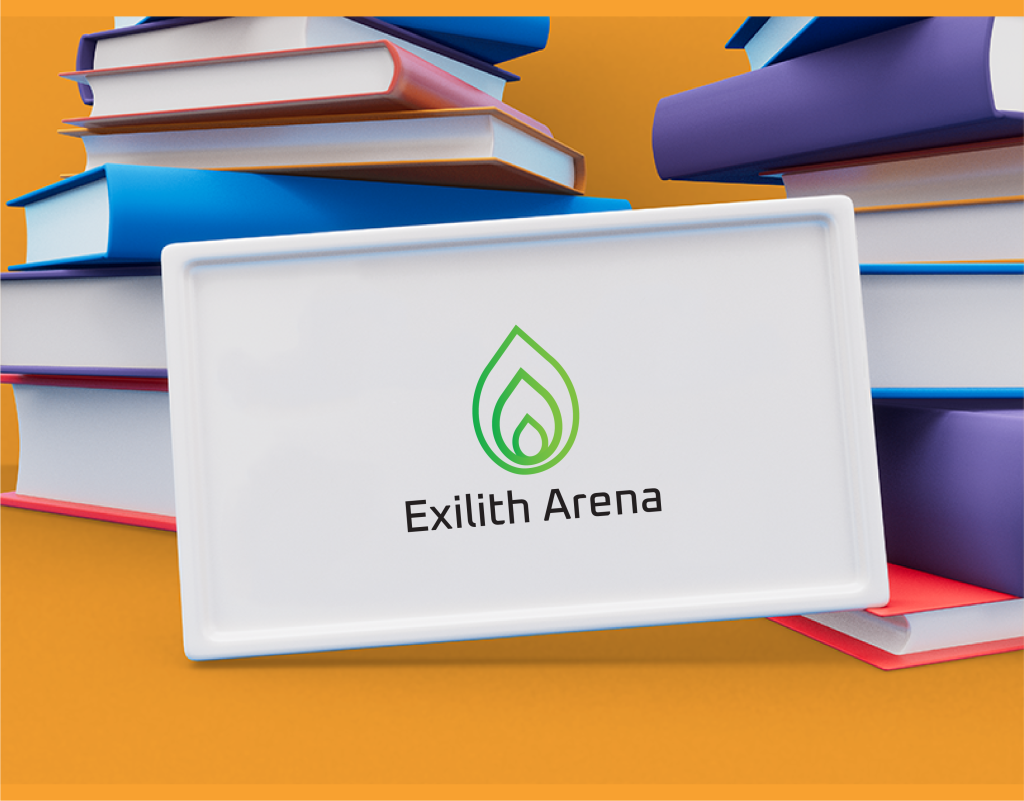
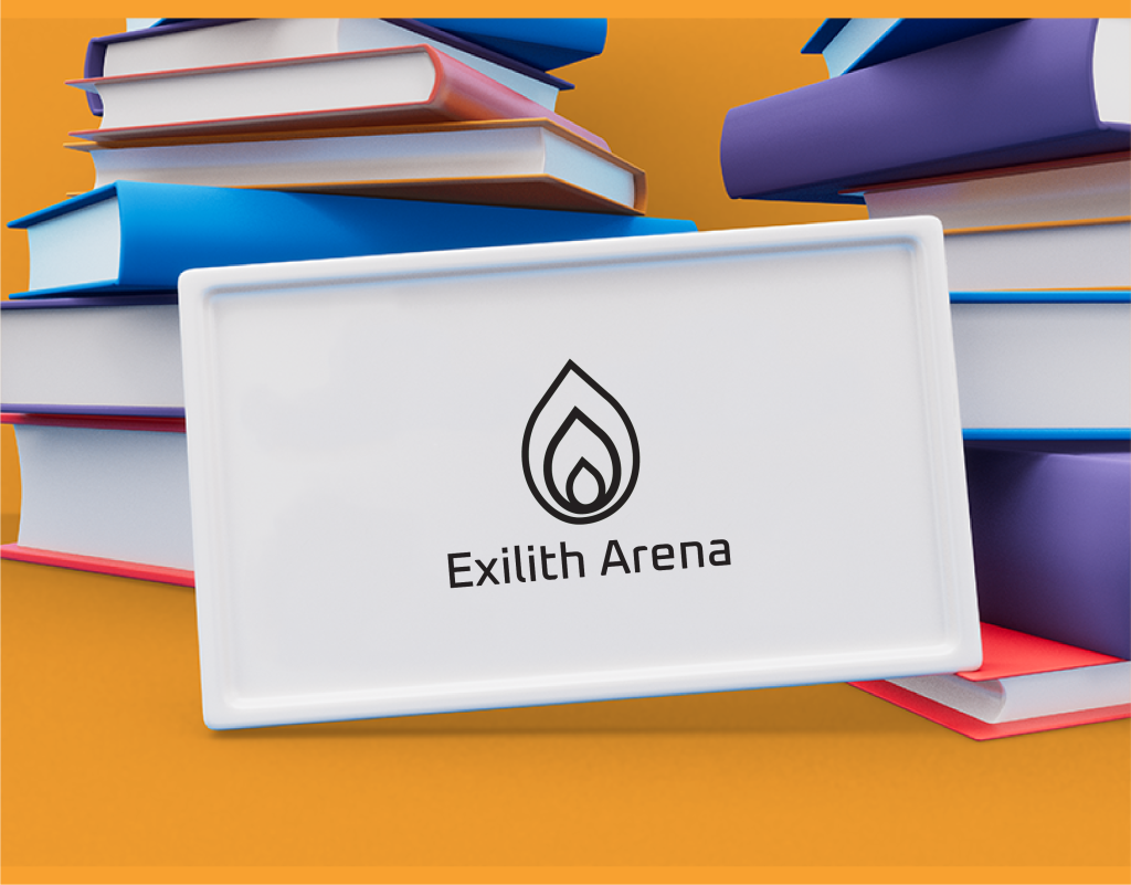
In this project, I developed three logo variations for Exiith Arena. Each logo incorporates a stylized flame and water drop, representing the concept of duality.
Concept Development
Fire and water are symbolic opposites – fire representing passion and power, water symbolizing calmness and adaptability. I wanted to explore how these elements could be visually combined to represent a balanced brand identity for Exiith Arena. Perhaps it’s a company that embodies both fierce drive and strategic composure, or passionate creativity met with thoughtful execution.
Design Execution
- Elements: The core concept features a stylized flame motif positioned upwards, counterbalanced by a teardrop shape representing water. A circle, symbolizing unity and wholeness, encloses both elements.
-
Variations: I explored three color palettes:
- Logo 1 (Red and Blue): This direct color association between fire (red) and water (blue) creates a bold and literal representation.
- Logo 2 (Orange and Teal): This option utilizes a more subdued color scheme while still hinting at warmth (orange) and coolness (teal).
- Logo 3 (Black and White): The absence of color offers a sophisticated and minimalist aesthetic, allowing the form itself to take center stage.
Client Choice and Next Steps
While this case study doesn’t reveal the chosen logo, each variation offers a distinct personality. I presented these options to the client to facilitate discussion about the brand identity they wish to cultivate. Following their selection, we can move forward with logo refinement and brand style guide development.
Overall Thoughts
This project exemplifies the value of logo exploration. By presenting a range of design directions, I empower clients to actively participate in shaping their brand image. The fire and water symbolism adds depth and memorability, sparking the viewer’s imagination.


Client
Exiith Arena
Services
Logo Design
Project
Dynamic
Conclusion
This case study demonstrates an effective approach to logo design exploration. By presenting multiple variations on a core concept, the designer allows the client to consider different design directions and choose the one that best reflects their brand. The use of fire and water symbolism adds a layer of meaning and intrigue to the logo, leaving a lasting impression on the viewer.