Cripsy Capture Logo Design

Overview
This case study details the development of the “Cripsy Capture” logo, designed to represent a modern and dynamic brand in the photography and videography industry. The logo aims to convey creativity, clarity, and professionalism, encapsulated within a visually striking and memorable design.
Objectives
- Brand Representation: Develop a logo that clearly represents the core values and identity of Cripsy Capture.
- Versatility: Ensure the logo can be effectively used across various platforms and mediums.
- Memorability: Create a unique and memorable design that stands out in the competitive market.
Design Elements
-
Color Scheme:
- White: Symbolizes clarity, purity, and simplicity.
- Red and Green: In the second version, red conveys passion and energy, while green suggests growth and creativity.
- Black: Used in the third version to represent sophistication and elegance.
-
Typography:
- Bold and Clean Font: The typography is straightforward and bold, enhancing readability and conveying professionalism.
- Italicized Style: Adds a sense of motion and dynamism, reflecting the active and creative nature of the brand.
-
Symbolism:
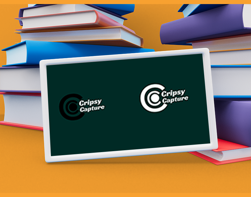
- Double C’s: The overlapping ‘C’ shapes in the logo symbolize the name “Cripsy Capture” and suggest a lens or a camera, directly linking to the photography and videography services.
- Target Circle: The inner circle represents focus and precision, essential qualities in photography and videography.
Design Process
-
Research and Analysis:
- Studied the market and competitor logos to identify trends and opportunities for differentiation.
- Conducted a brand analysis to understand Cripsy Capture’s mission, vision, and values.
-
Concept Development:
- Sketched multiple concepts focusing on integrating the initials ‘C’ and visual elements related to photography.
- Explored various color schemes to find the most effective combination for conveying the brand’s identity.
-
Digital Drafts and Iteration:
- Created digital versions of the top concepts using design software.
- Iteratively refined the designs based on feedback from stakeholders, focusing on balance, symmetry, and visual impact.
-
Finalization:
- Selected the most effective design and fine-tuned details such as spacing, alignment, and color balance.
- Developed three color variations to ensure versatility across different backgrounds and use cases.
Logo Variations
-
White on Dark Background:
- Usage: Ideal for websites, social media profiles, and digital applications where a clean and modern look is desired.
- Impact: Stands out against dark backgrounds, ensuring the logo is prominent and easily recognizable.
-
Red and Green on Dark Background:
- Usage: Suitable for promotional materials, advertisements, and branding where a vibrant and energetic look is needed.
- Impact: The combination of red and green draws attention and conveys creativity and passion.
-
Black on Dark Background:
- Usage: Best for high-end branding materials, corporate documents, and formal presentations.
- Impact: Exudes sophistication and professionalism, making it perfect for premium services and serious branding efforts.
Results
- Enhanced Brand Identity: The logo effectively encapsulates the essence of Cripsy Capture, making it instantly recognizable.
- Versatile Application: The three variations allow for consistent branding across different platforms and mediums.
- Positive Feedback: Received acclaim from stakeholders for its modern look, clarity, and the symbolic representation of the brand.
Future Recommendations
- Brand Guidelines: Develop comprehensive guidelines to ensure consistent logo application across all branding materials.
- Continuous Evaluation: Regularly assess the logo’s effectiveness and make updates as needed to keep it relevant.
- Extended Branding: Explore additional branding elements such as color palettes, typography, and graphic styles that complement the logo and strengthen the overall brand identity.
This case study demonstrates the successful creation of a dynamic and professional logo that effectively represents the Cripsy Capture brand in the competitive photography and videography industry.


Client
Cripsy Capture
Services
Logo Design
Project
Dynamic
Conclusion
The Cripsy Capture logo design project successfully met all objectives, resulting in a versatile, memorable, and brand-aligned logo. The process highlighted the importance of research, iterative feedback, and attention to detail in creating an effective visual identity.