Bee Hour Logo Design

Overview
This case study explores the creation of the “Bee Hour” logo, crafted to represent a brand centered around natural, sustainable, and eco-friendly products and services. The logo incorporates elements that symbolize the industrious and essential role of bees, aligning with the brand’s focus on nature and sustainability.
Objectives
- Brand Representation: Develop a logo that encapsulates the essence of Bee Hour’s commitment to nature, sustainability, and eco-friendliness.
- Elegance and Simplicity: Ensure the design is elegant, clean, and easily recognizable.
- Versatility: Create a logo that can be effectively used across various mediums, including packaging, marketing materials, and digital platforms.
Design Elements
-
Color Scheme:
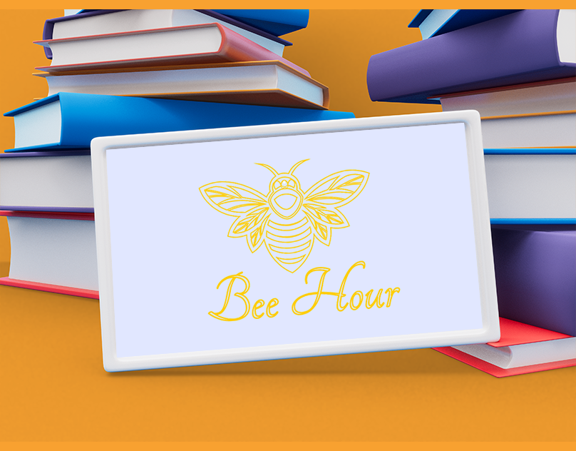
- Gold: Represents quality, luxury, and the valuable role bees play in our ecosystem.
- Light Blue Background: Conveys calmness, trust, and a sense of environmental purity.
-
Typography:
- Script Font: The elegant script font used for “Bee Hour” adds a touch of sophistication and aligns with the premium nature of the brand.
-
Symbolism:
- Bee Illustration: The central bee image is detailed and stylized, reflecting the intricate and vital work of bees. The wings and body are crafted with geometric precision to evoke a sense of harmony and natural beauty.
Design Process
-
Research and Inspiration:
- Conducted thorough research into bee symbolism and its importance in nature to inform the design direction.
- Analyzed competitor logos and branding to identify unique elements that would make Bee Hour stand out.
-
Concept Development:
- Sketched multiple concepts focusing on different representations of bees and nature.
- Explored various typography styles to find one that complements the bee illustration while maintaining readability and elegance.
-
Digital Drafts and Iteration:
- Created digital versions of the top concepts using design software.
- Iteratively refined the bee illustration and typography, ensuring balance and cohesion between elements.
- Adjusted color schemes and tested the logo against different backgrounds to ensure versatility and visibility.
-
Finalization:
- Selected the most effective design and fine-tuned details such as line thickness, spacing, and color balance.
- Ensured the logo works well in both color and monochrome formats for diverse applications.
Logo Application
-
Packaging:
- Usage: Used on product packaging to enhance brand recognition and convey a premium look.
- Impact: The gold and blue color scheme creates an attractive and memorable package design that stands out on shelves.
-
Digital Platforms:
- Usage: Featured on the website, social media profiles, and digital advertisements.
- Impact: The clean and elegant design ensures the logo is legible and appealing across various digital devices and screen sizes.
-
Marketing Materials:
- Usage: Incorporated into brochures, business cards, and promotional materials.
- Impact: Adds a professional and cohesive look to all marketing efforts, reinforcing brand identity and values.
Results
- Enhanced Brand Identity: The logo effectively represents Bee Hour’s commitment to nature, quality, and sustainability, making it easily recognizable.
- Positive Feedback: Received positive responses from stakeholders and customers, praising its elegance and the clear connection to the brand’s mission.
- Versatile Usage: Successfully used across various mediums, maintaining consistency and visual appeal.


Client
Bee Hour
Service
Logo Design
Project
Dynamic
Conclusion
The Bee Hour logo design project achieved its objectives, resulting in a sophisticated and versatile logo that embodies the brand’s values. The process highlighted the importance of research, iterative refinement, and attention to detail in creating a meaningful and impactful visual identity.
Future Recommendations
- Brand Guidelines: Develop comprehensive guidelines to ensure consistent logo application and maintain brand integrity across all materials.
- Extended Branding: Explore additional branding elements such as color palettes, typography, and graphic styles that complement the logo and enhance overall brand identity.
- Regular Updates: Periodically review the logo and branding materials to ensure they remain relevant and effective in communicating the brand’s message.
This case study demonstrates the successful creation of a refined and impactful logo for Bee Hour, effectively representing the brand’s dedication to sustainability and natural quality.